FINE ART CATALOGUE 2014
Fine Art Catalogue 2014
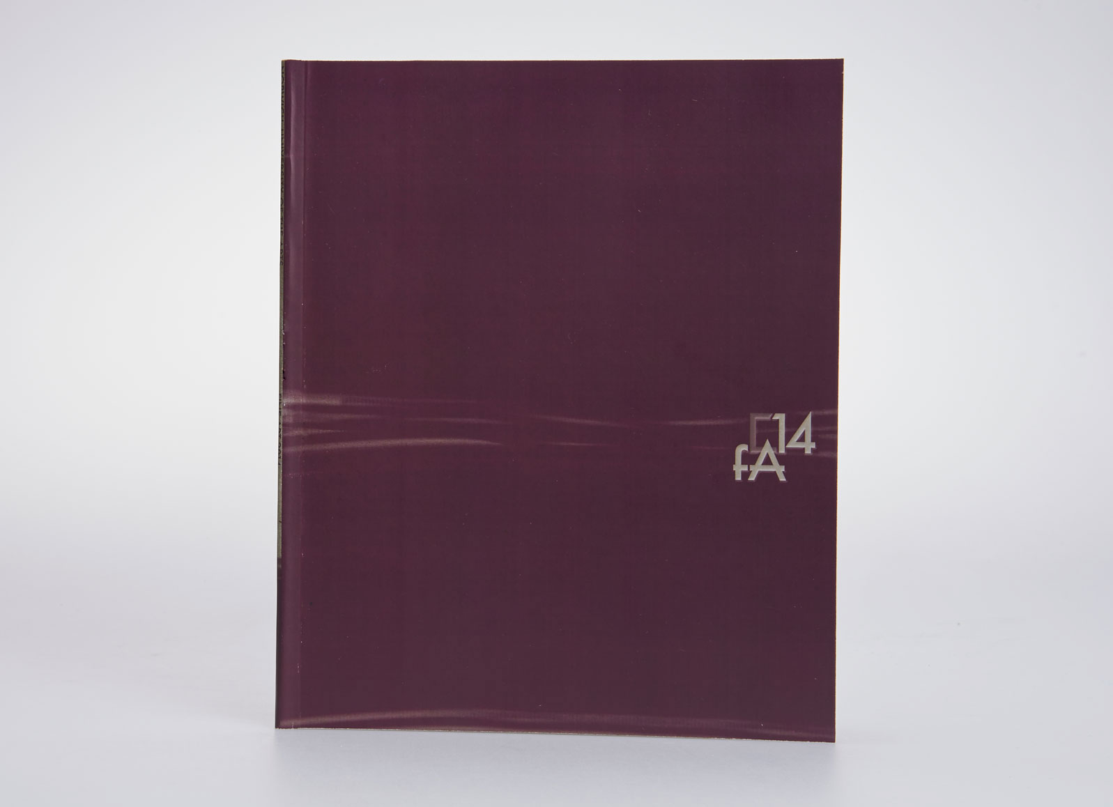
The inspiration for my design was initially the art of Mark Rothko and his almost geometric division of canvas focused on the texture and structure of paintings. I was interested in producing fine art catalogue, which was simple in the structure with new elements, shape of text frames, underlined fragments of the text e.g. names of students, becoming leading motif related to the subtle smudge of paint, stroke of the brush. I introduced this element on the cover and created the logo. I decided to use Futura in a limited variation of weights and sizes. The project has developed in more structured form according to 3 columns grid with division in sections with different backgrounds; grey for additional materials, white for students. I am very glad, that I had opportunity to work on this project, as this process allowed me to recognize many typographic problems and features.